
NHS Countess of Chester Hospital
Category
Graphic Design Chester, Web Design
Date
20th January 2016
Client
NHS Countess of Chester Hospital
The Brief
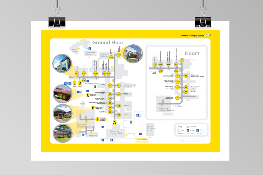
The Countess of Chester NHS Hospital had an ailment – their existing hospital site maps were complicated and visually incoherent. They approached us to provide some much needed visual first aid.
The Solution
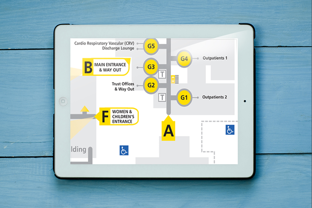
We wanted the maps to be a visual representation of the common language directions we give when asked by lost motorists: ‘second on the left’ or ‘third on the right’ etc.
We developed a simple schematic representation of the hospital, using the concept of the iconic London Underground mapping system designed by Harry Beck in 1933.
We removed all superfluous information and adopted a simple 2 colour palette. It was more important for patients to be able to immediately recognise their entrance point and their specific destination than the map being geographically accurate.
By working closely with the Countess’ in-house communications team, we were able to provide a solution that was simple, beautiful and easily adaptable to other NHS sites.
“Lemondrop interpreted a complicated and dated visual representation of the hospital and devised a simple and easy to navigate map illustration to be used throughout the site on walls and on letters to patients.”
"Jenni Collins, Corporate Communications Graphic Design Lead"